Why Supermarket Layouts Make Quick Trips Feel Longer
An everyday design explainer on store entrances, shelf placement, promotions, checkout zones, and why quick grocery trips often expand.
Translate the everyday question into simple mechanisms, limits and observable details.
Why Supermarket Layouts Make Quick Trips Feel Longer
A supermarket can turn a five-item errand into a slow loop without anyone forcing you to wander. The layout, lighting, shelf height, sound, product grouping, and checkout design all shape how a shopper moves and notices. This does not mean every store is a trick. Stores also need to manage deliveries, fresh food, queues, accessibility, safety, and theft prevention. Still, the ordinary design choices are worth understanding because they affect time, attention, and spending.
This is a general culture and consumer-behavior explainer, not financial advice. For readers interested in consumer protection and advertising basics, the U.S. Federal Trade Commission publishes guidance on <a href=“https://consumer.ftc.gov/”>consumer topics</a>, while UK readers can compare broader consumer information from <a href=“https://www.gov.uk/consumer-protection-rights”>GOV.UK consumer rights pages</a>.
The entrance slows your pace
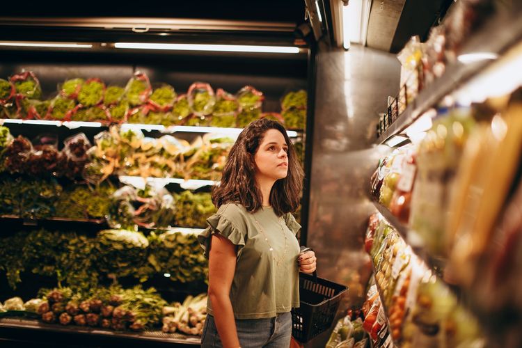
Many stores place produce, flowers, bakery smells, or seasonal displays near the entrance. These areas create a transition from parking lot or street into shopping mode. People slow down, adjust bags, take out a list, and begin browsing. Fresh items also signal abundance and quality, even when the main purpose of the trip is milk, soap, or pasta.
The entrance zone is not only decorative. It helps the store manage traffic and present high-appeal goods first. For the shopper, it is a reminder to switch from wandering to intention: list in hand, basket size chosen, and route decided before the first display changes the plan.
Essentials are often spread apart
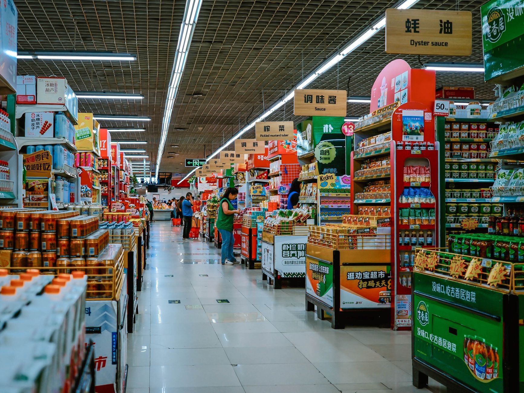
Milk, bread, eggs, fruit, pharmacy items, and household basics may sit in different corners. There are practical reasons: refrigeration, delivery access, department staffing, and food safety. The side effect is that a quick trip crosses more aisles than expected. Every extra aisle creates more chances to notice promotions, forgotten needs, or impulse items.
A simple response is to write lists by store zone, not by meal. Group produce, chilled items, dry goods, household goods, and checkout items. This reduces backtracking and makes the store feel less like a maze.
Eye level is valuable space
Shelves are not neutral. Eye-level placement is easier to notice, and end caps at aisle ends feel like recommendations even when they are paid promotions or inventory priorities. Lower shelves may hold bulk, budget, children’s items, or heavier goods. Higher shelves may hold slower-moving stock or products aimed at adults who already know what they want.
The useful habit is a three-shelf scan. Before choosing, look high, middle, and low. Unit pricing can help where available, although package sizes and promotions still require attention. In the US, the National Institute of Standards and Technology has background on <a href=“https://www.nist.gov/pml/owm/metric-si/unit-pricing-guide”>unit pricing</a>, a small label that can make comparisons less emotional.
The short scenario: a bread-and-milk trip
Imagine someone entering for bread and milk. The basket is small, so the trip feels controlled. Produce looks good, so apples go in. A bakery display smells warm. The milk is at the back, so the shopper passes cereal. The bread is across the store, near jam and peanut butter. At checkout, batteries, gum, and small drinks wait at hand height.
Nothing in this scenario requires deception. It is a series of small invitations placed along a route. The shopper who knows the route can still buy only bread and milk, but they must decide several more times than the list suggested.
Lighting and sound change the tempo
Bright, even lighting makes labels readable and fresh goods attractive. Softer lighting may make premium sections feel calmer. Music can affect pace, although real-world effects vary by store, crowding, and shopper mood. What matters practically is that the environment can make browsing feel less like work.
If you are trying to shop quickly, use your own time cue. A list with ten items, a basket instead of a trolley, or a planned route can counter the drift. The store sets a tempo; you can bring your own.
Promotions create comparison work
Buy-one-get-one offers, multi-buy pricing, loyalty discounts, digital coupons, and “member price” labels ask the shopper to do mental math. Sometimes the deal is useful. Sometimes it shifts attention away from whether the item was needed at all. A pantry full of discounted food that expires unused is not a saving.
Use a two-question rule: would I buy this without the deal, and can I use it before it expires? If the answer to either question is no, the promotion is entertainment, not value.
Checkout is a final attention test
Checkout zones place small, high-margin, easy-to-grab items near a waiting shopper. The queue creates idle time. Children may be at display height. Adults may be tired from decisions. Self-checkout adds another layer: scanning, bagging, alerts, coupons, payment, and receipt choices.
A practical checkout habit is to review the basket before joining the line. Remove duplicates, mood purchases, or items that no longer match the meal plan. It is easier to decide before the queue than while the person behind you is waiting.
What helps without making shopping joyless
You do not need to treat every store as hostile. Good food, seasonal displays, and discovery can be part of normal life. The point is to decide when the trip is practical and when it is browsing. Mixing those modes is what makes quick trips feel strangely long.
Try a route list for ordinary weeks and a browsing budget for relaxed trips. One protects time. The other allows pleasure without pretending every attractive display is a household need.
Accessibility and local habits matter
Not every layout affects every person the same way. A wheelchair user, parent with a pram, elderly shopper, neurodivergent shopper, or person shopping in a second language may experience the same store very differently. Crowding, signage, aisle width, lighting glare, and noise can change a practical errand into a tiring task.
Smaller neighborhood shops may feel easier because staff and layout are familiar. Large stores may offer more choice but more decisions. The best strategy is the one that fits the person, not the one that sounds efficient in theory.
Read the store once, then reuse the knowledge
The next time you shop, notice the route without judging yourself. Where do you slow down? Which aisle pulls you off list? Which labels make comparison difficult? Which section creates the most impulse buys? A supermarket is a designed environment, but noticing the design gives you back some control.
Quick trips feel longer because they contain more decisions than the list admits. Reduce the decisions, and the store becomes ordinary again.
Loyalty apps add another layer
Digital coupons and loyalty apps can be useful, but they move part of the shop onto a screen. A shopper may pause in the aisle to clip offers, compare member prices, scan barcodes, or check whether a discount loaded correctly. That can save money, yet it also extends the trip and adds more decisions.
There is also a privacy tradeoff. Loyalty schemes may connect purchases to an account so retailers can personalize offers and measure behavior. Some shoppers accept that exchange; others prefer less tracking. The practical point is to decide intentionally rather than treating every app prompt as part of the groceries.
Store layout changes reset your habits
When a familiar store moves aisles, the trip suddenly feels longer because your body cannot follow its usual route. Retailers may rearrange sections for renovation, seasonal stock, product strategy, or supply reasons. The effect is the same: more looking, more asking, more exposure to shelves you normally skip.
If a store has changed, take one slow trip to relearn it rather than turning every errand into a search. After that, update your list order. Small planning sounds dull, but it is how a designed space becomes manageable again.
Basket size changes behavior
A trolley invites a larger shop. A hand basket creates a physical limit. Stores know that capacity affects behavior, but shoppers can use that knowledge too. If the errand is small, choose the smallest carrying option that fits the list. If the shop is weekly and heavy, choose the trolley and accept that the trip has a different purpose.
The carrying choice also affects speed. A person with a basket feels weight quickly and may move toward checkout sooner. A trolley hides that signal. This is not a moral issue; it is a design cue. Choosing the right cue before entering is easier than resisting every aisle later.
Children and companions change the route
A quick trip with another person often becomes longer because there are two sets of attention. Children notice checkout sweets, toys, cereal characters, and seasonal displays. Adults shopping together may split up, compare brands, or remember extra needs. The trip becomes social and negotiated rather than linear.
If time matters, agree on the list and route before entering. If the trip is meant to be relaxed, allow that and stop calling it quick. Many shopping frustrations come from pretending one mode is another.
Unit prices reduce shelf theatre
Large labels and bright promotions often pull attention toward the deal, while the smaller unit price tells the calmer story. Comparing price per ounce, pound, gram, kilogram, litre, or item can reveal whether a family pack is actually cheaper or whether a smaller pack is better for a household that wastes less. Unit pricing is not perfect because quality, storage space, and dietary needs still matter, but it slows the reflex to grab the loudest offer.
This is especially useful for products with shrinking package sizes. A familiar box may contain less than it used to, while the shelf position and branding remain the same. The shelf says recognition; the unit price says comparison.
Online grocery layouts have versions of the same design
Digital shops have their own aisles: sponsored placements, “buy again” rows, recipe prompts, substitutions, bundles, and minimum-order nudges. They can save time because search is faster, but they can also hide alternatives below sponsored results or encourage repeating old purchases without checking price changes.
Use saved lists for staples, then review them occasionally. If an item has become expensive, unavailable, or unnecessary, remove it. Online convenience works best when the list stays current rather than becoming an automatic reorder of last month’s habits.