Why Grocery Stores Put Ordinary Items in Surprising Places
A plain-English look at grocery store layout, shopper habits, and why milk, batteries, flowers, and spices often sit where you least expect them.
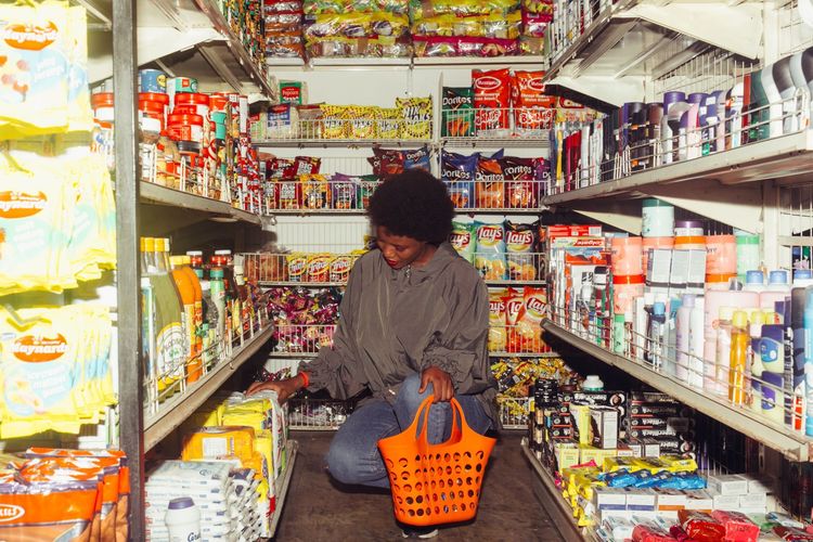
Translate the everyday question into simple mechanisms, limits and observable details.
Why Grocery Stores Put Ordinary Items in Surprising Places
Grocery stores can feel like puzzles designed by someone who knows you are tired. Milk is at the back. Batteries are near checkout, but also sometimes near hardware. Flowers greet you before bread. Spices may sit in baking, international foods, or both. The layout is not random, though it is not always as sinister as people assume. Stores are trying to manage space, traffic, labor, freshness, supplier agreements, and shopper habits at the same time.
The back-of-store milk question
Milk often sits near the back because refrigerated cases need power, service access, and restocking paths. Back walls are useful for big cold cases. Many shoppers also buy milk regularly, so placing it deeper in the store brings people past other categories. Both things can be true: the layout solves a practical building problem and also shapes the trip.
This is why one simple explanation is usually too neat. A city corner market, a suburban supermarket, and a discount grocer do not have the same floor plan. The same item may move because the building, delivery schedule, or customer base is different.
A small map of common placement choices
| Item | Why it may be there | What shoppers notice |
|---|---|---|
| Flowers | Near entrance for freshness cues and quick gifts | The store feels brighter before the practical shopping starts |
| Milk and eggs | Near refrigerated service zones | The quick trip becomes a longer walk |
| Batteries | Checkout, seasonal, or hardware-style sections | They are easy to forget until the end |
| Spices | Baking aisle plus cuisine-specific shelves | Duplicate locations can be confusing |
| Bread | Perimeter, bakery, or packaged-food aisle | Fresh and packaged bread may split into two trips |
The entrance sets the mood
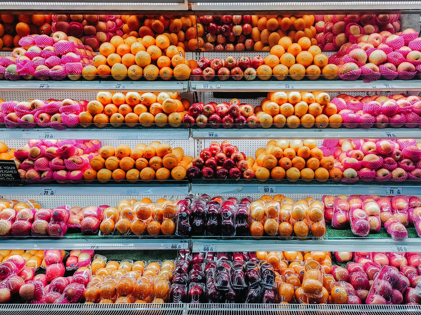
Fresh produce, flowers, bakery smells, and seasonal displays often appear near the entrance because they change the first impression. A shopper who walks into color and freshness may feel differently than one who walks into paper towels and pet litter. That does not mean everyone buys more automatically. It means the store is using the first thirty seconds carefully.
There is also a practical side. Produce needs staff attention. Damaged fruit, empty bins, and temperature problems show quickly. Keeping high-touch fresh departments near staffed zones can make management easier.
Why essentials are spread out
A shopping list may contain bread, milk, bananas, toilet paper, pasta, and toothpaste. Those items live in different departments because they need different storage, shelving, suppliers, or restocking rhythms. But spreading them out also increases the chance that shoppers see other products.
The Federal Trade Commission discusses retail competition and pricing in broader terms, including how stores compete through price, convenience, and services rather than layout alone: https://www.ftc.gov/news-events/topics/competition-enforcement/retail. Layout is one piece of the retail system, not the whole story.
The “I swear they moved this” effect
Stores do move items. Sometimes a brand pays for a display. Sometimes a category expands. Sometimes seasonal goods take over an aisle end. Sometimes a store remodels because delivery patterns changed. And sometimes the item did not move; you entered through a different door or shopped while distracted.
This matters because shoppers build body memory. You do not read every aisle sign on a familiar trip. You walk to where the pasta usually is. When the store changes, it feels personal because it interrupts a routine that was almost automatic.
End caps are not neutral shelves
The displays at the ends of aisles are valuable because many shoppers pass them. An end cap may hold sale items, seasonal goods, new products, or supplier-supported displays. The position can make an item feel more important even when the price is ordinary.
A useful habit is to check the unit price, not just the sign. In the United States, many stores show unit pricing, though rules vary by state. In the UK and EU, unit pricing is also a common consumer-information tool. The point is simple: a big display does not prove a better deal.
Why the same item appears twice
Duplicate placement can be helpful or annoying. Tortillas may appear near bread and near Mexican ingredients. Lemon juice may sit by baking and by produce. Crackers may be in snacks and on a cheese display. Stores do this because shoppers think in meals, not only in categories.
This is one reason aisle signs never solve everything. A person making tacos, a person replacing pantry staples, and a person shopping for a party may look for the same product in different mental locations.
A calmer way to shop the layout
If a store layout keeps wasting your time, make a list in the order you walk the store. Group cold items together so they spend less time in the cart. Treat end caps as suggestions, not instructions. For unfamiliar stores, shop the perimeter first only if that matches your list; the old perimeter rule is too blunt because useful staples also live in inner aisles.
Grocery stores are designed environments, but they are still constrained by delivery doors, refrigerators, labor, lease terms, food safety routines, and local habits. The surprise is not that stores influence shoppers. The surprise is how much ordinary plumbing, restocking, and habit sit behind the feeling that the cinnamon has disappeared again.
Children, speed, and the quick-trip myth
A store layout feels different when you are shopping with a child, a mobility aid, a strict lunch break, or a small basket that gets heavy fast. Retail planning often talks about average trips, but real trips have pressure. A parent may avoid a long route because passing the cereal aisle creates a negotiation. An older shopper may prefer a store where staples are predictable over one with frequent promotional resets.
That is why convenience formats survive even when they cost more. A smaller shop with fewer choices can be easier than a large store where every bargain requires another aisle. The best layout for the store is not always the best layout for the shopper on that day.
Why local stores feel different from chains
Independent grocers may place items according to local habits, owner judgment, or the physical limits of an older building. A chain store may follow planograms, which are shelf plans that tell staff where products should sit. Even then, local managers may adjust for stock, theft risk, delivery timing, or neighborhood demand.
This explains why the same brand can feel different across branches. One store may put rice in a world-food section because that is how head office organizes it. Another may keep large bags near staples because local shoppers buy them weekly. Both choices can make sense inside their own customer pattern.
The shopper’s counter-strategy
You do not need to outsmart the whole store. A few habits do enough. Keep a reusable list organized by your usual route. Photograph the shelf label if an item is often out of stock, so you know the exact size and name next time. Check high and low shelves, not only eye level. Look for duplicate placements when an ingredient fits more than one meal category.
If you are comparing prices, use unit price and package size. If a display looks urgent, ask whether you came for that item before you saw it. These small pauses keep the store from making every decision for you.